
Art Auction Data: Exploratory Data Analysis, Andy Warhol Case Study
A series of posts related to an art auction price model project.
Art Auction Data: Exploratory Data Analysis, Andy Warhol Case Study
Now that I have a better sense of how the various features in this dataset relate to realized price, I want to look at a specific artist, since my sense is that individual artist markets obey their own unique logics. (In fact, I’d wager that this is true at an even more granular level of specific bodies of work, but I digress.)
Introductory Notes
Much of this analysis follows a similar trajectory as the more general EDA I’ve done for this dataset, except this time with an eye towards the specific logic of Andy Warhol’s painting market for the past 30-40 years. As with the general EDA for this project, I have opted to use constant 2022 dollars rather than nominal dollars from each observation’s given auction year in order to eliminate the inflation variable from analysis to the extent that this is possible. This means that price differences we see in similar artworks should be a function of Warhol’s painting market accruing value.
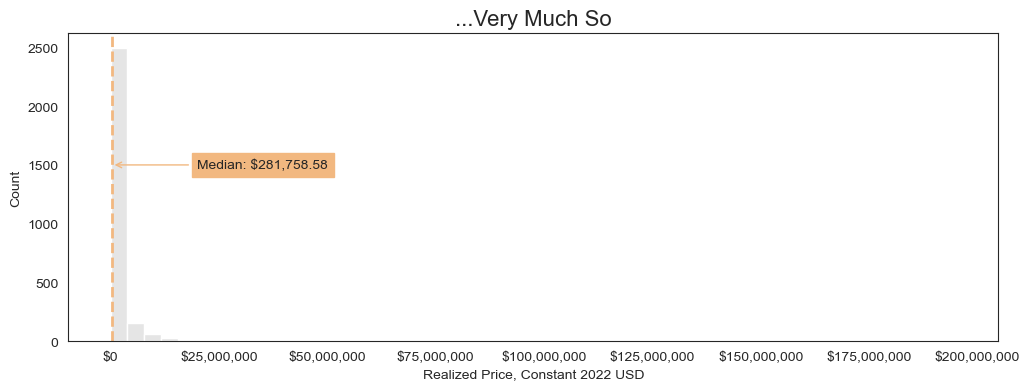
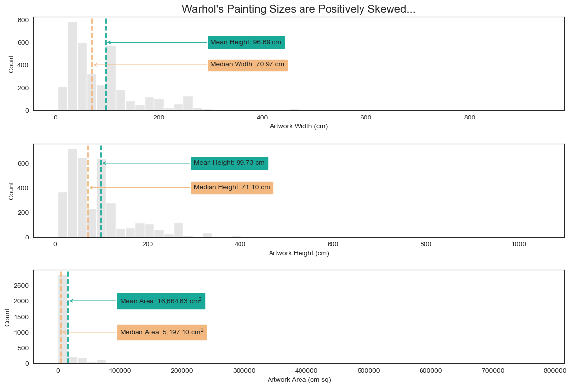
1. Warhol’s Auction Price Distribution is Positively Skewed but Log-Normal
As with the more general dataset, Warhol’s auction prices show an aggressively positive skew but are log normal.
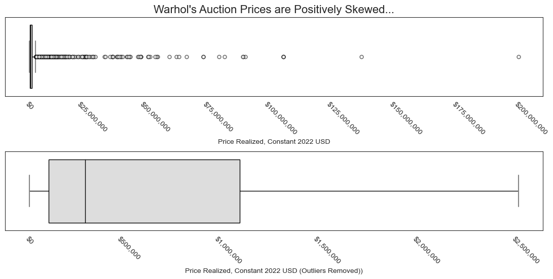
As we can see, the distribution has an aggressive positive skew, with one sale approaching \$200M–much higher than the median sale price, which looks closer to \$300k or so.
Let’s view the distribution as a histogram.
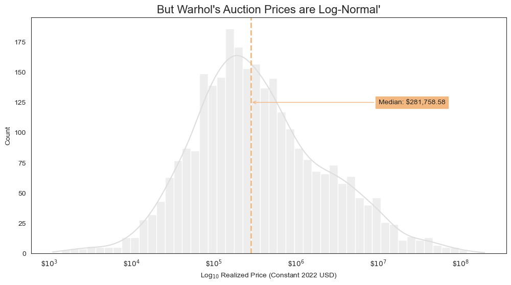
Seeing that Warhol’s auction prices are log normal suggests that our model will more effectively handle outliers if it predicts the log of auction prices.
2. Warhol’s Painting Dimensions are Also Log-Normal
Now let’s see if taking the log of these dimensions helps us see the distribution better.
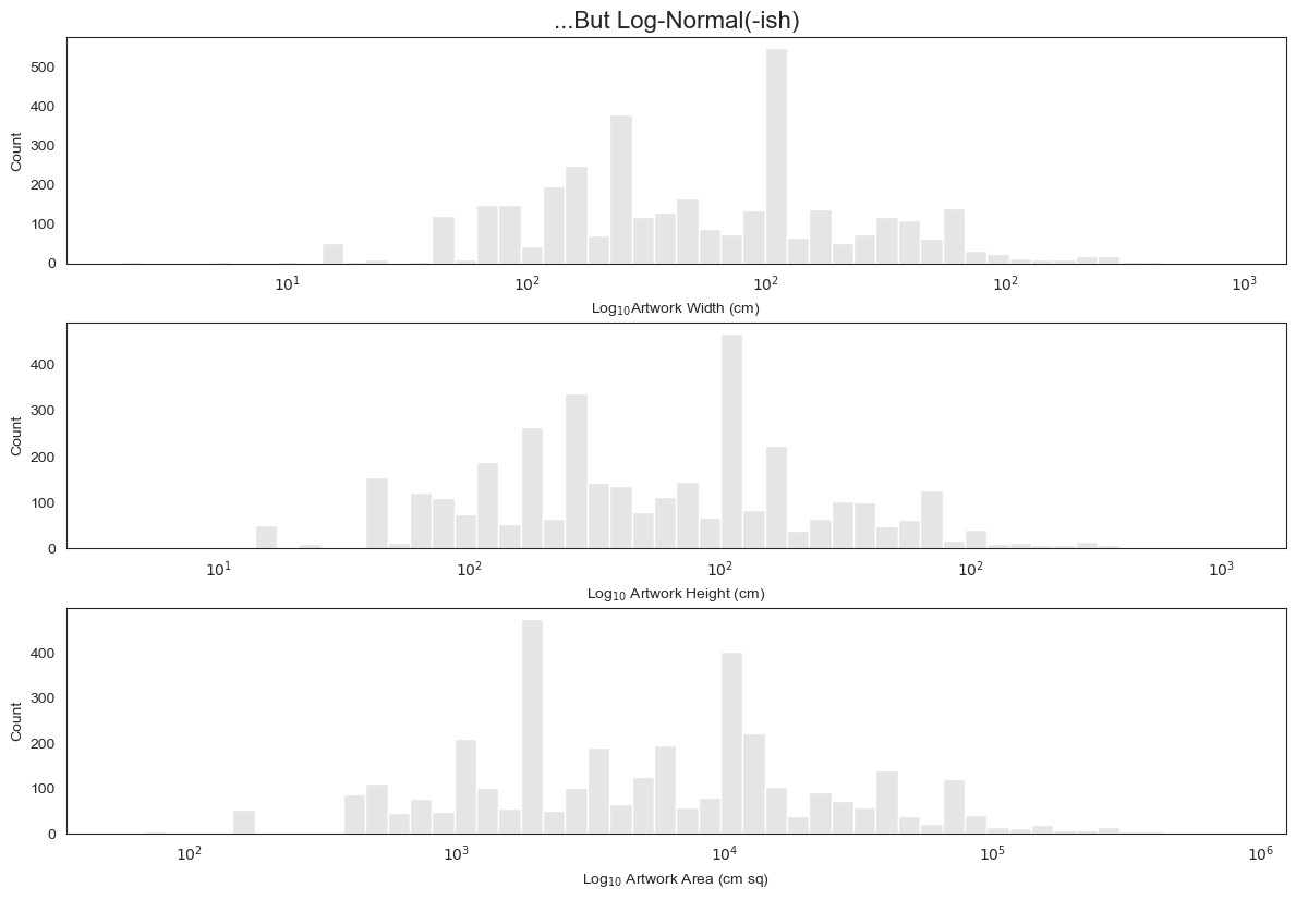
Looking at this, my instinct is that training the model not on the raw dimensions but on their log will help generate more accurate predictions.
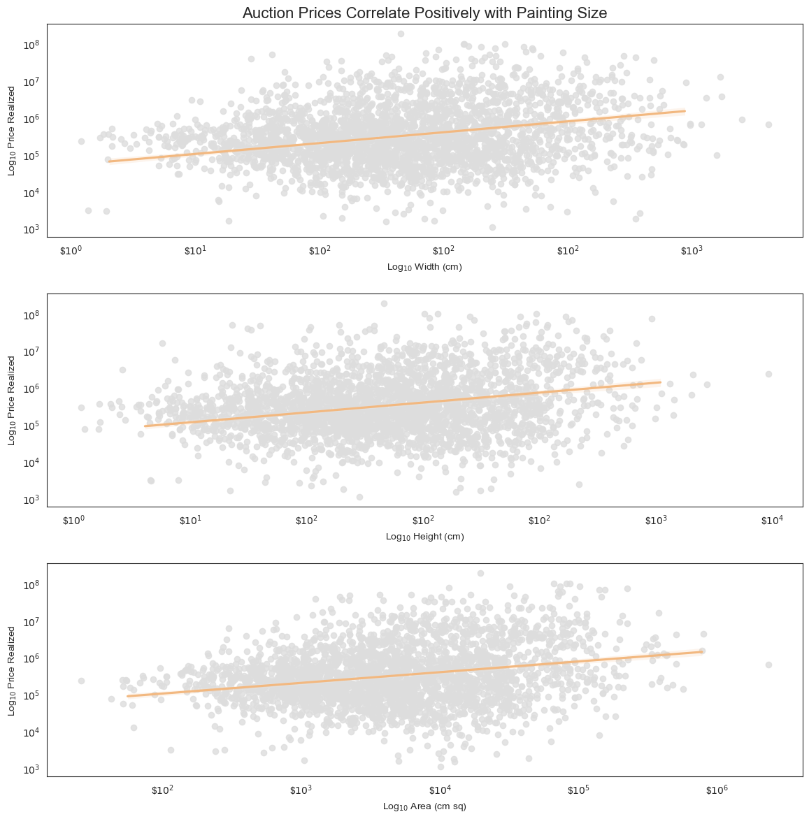
3. Auction Price and Painting Size are Positively Correlated for Warhol
What was true of the overall dataset is true in Warhol’s case, too.
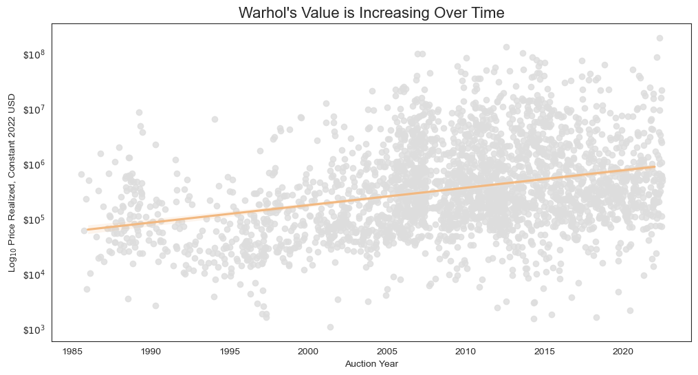
4. ICYMI: Warhol’s Value is Increasing Over Time
Since we’ve already adjusted for inflation, any change we see should be due to Warhol’s value increasing over time, not the incidental effects of inflation.
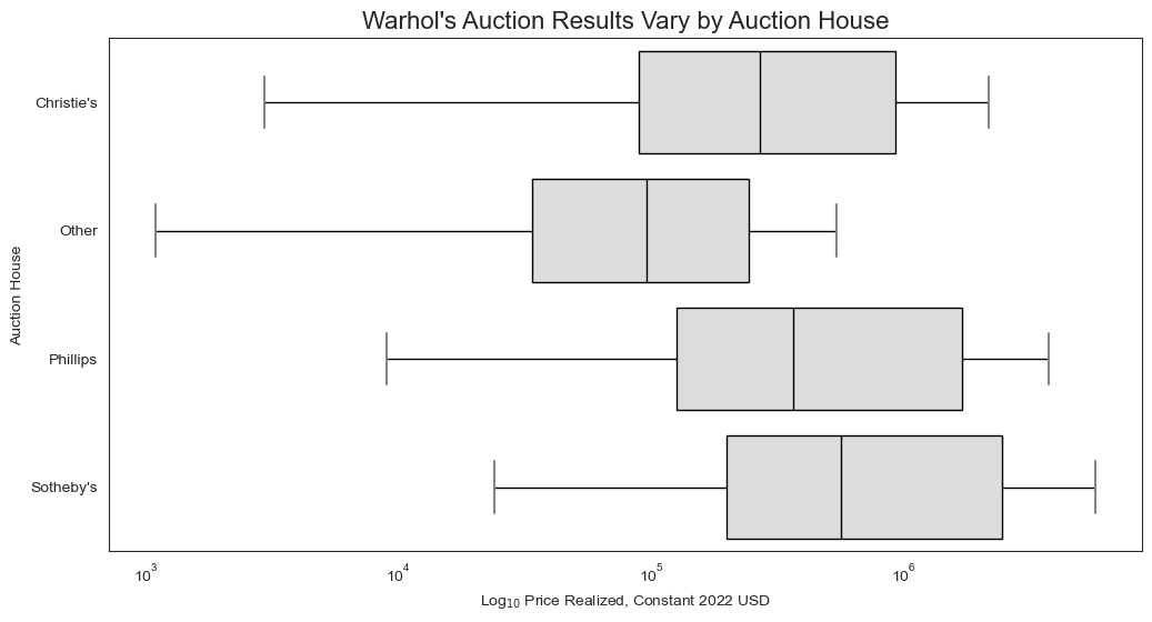
5. Prices Vary by Auction House
As with the larger dataset, prices for Warhol’s paintings vary by auction house.
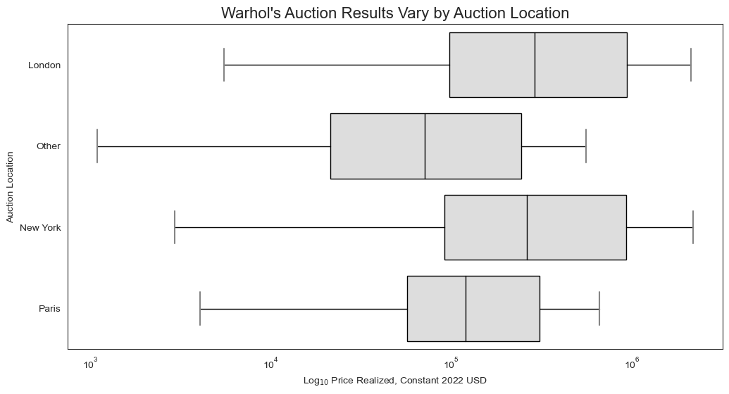
6. Prices Vary by Auction Location
Same is true of auction location.
7. Prices Vary by Auction Decade
This makes sense: Artist markets (like anything, really) go through cycles. In this case, it looks like the 2010s saw especially high sales, which could be a sign of more demand and/or less supply, or just a function of what works came up for auction at a given time
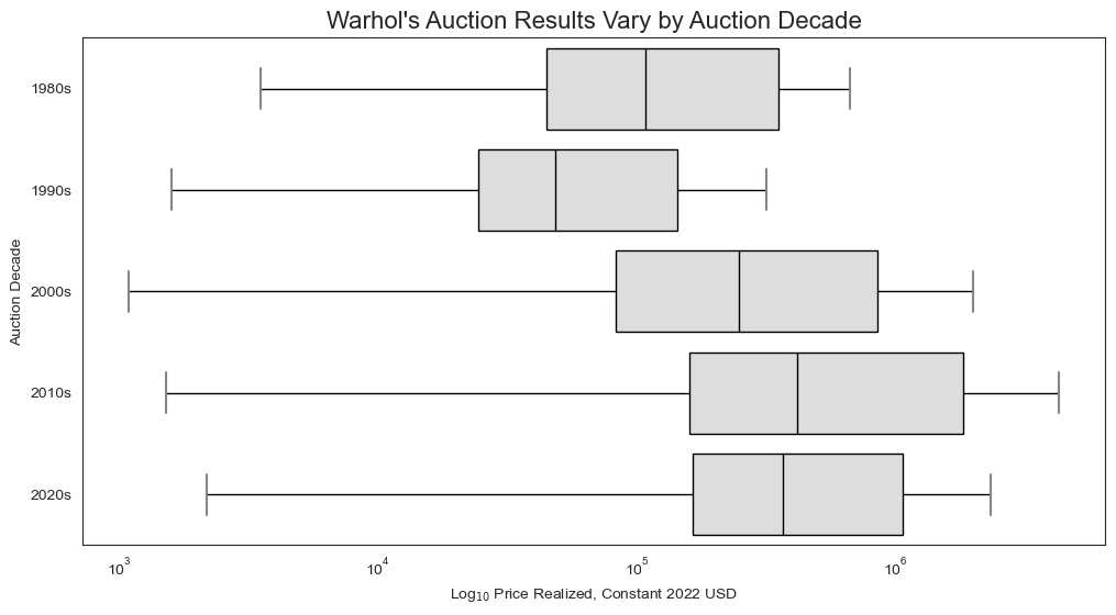
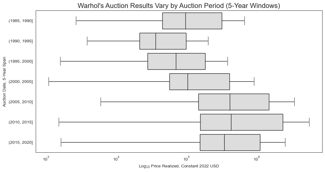
What if we look at a more granular level, say ever 5-year window?
8. Prices Vary by Artwork Date
This makes perfect sense–i.e., that certain periods of Warhol’s career will be more or less valuable than others. I expect this is a function of supply (works from certain periods may be more or less scarce) and historical significance (works from certain periods may be deemed more or less significant), among other things.
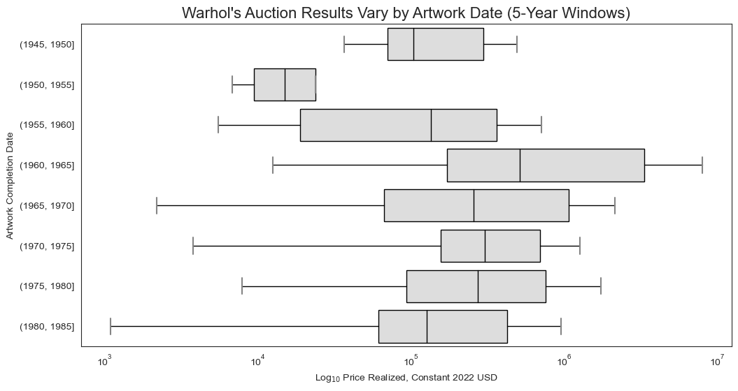
The artwork’s date poses some interesting problems when conceiving it as a feature for the entire dataset. For an artist like Warhol, the 1960s may be a hugely important time. Whereas for an artist who passed away in the 1950s, this same period would be meaningless.
One solution is to date artworks not by year but relative to an artist’s age. This would allow us to compare two works made at comparable periods in their artist’s life even if one was completed in 1920 and the other in 1965.
This solution would help normalize artwork dates, but it is still limited, since it does not account for the fact that some artists created their more important work early in their career and others later in their career.
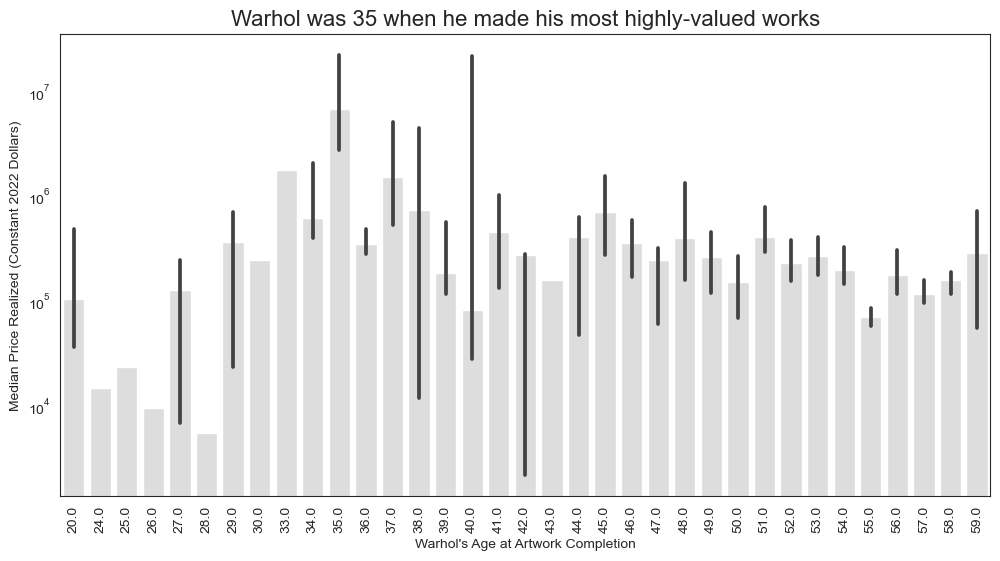
Warhol is actually an interesting example here, since he broke into the artwork relatively late in life, which many may not realize: Through his 20s he worked professionally as a commercial artist; it was not until he was 34 years old when he debuted his 32 Campbell’s Soup Can screenprint works at Ferus Gallery in Los Angeles in 1962! So it won’t come as any surprise, then, to see that Warhol’s most highly-valued works were made when he was 35-years old!
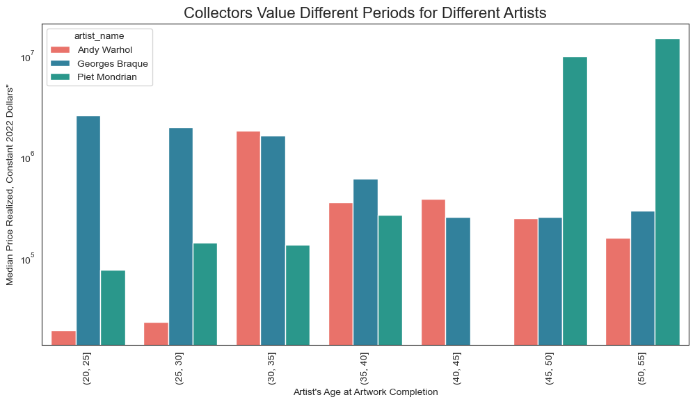
To make this point more concretely, look at how work made at various points in Warhol’s life compares to work made at the same periods in other artists’ lives.
For Warhol, the work made when he was 30–35 years old fetches the highest prices. For Mondrian, it’s his late work–stuff he made after 45. And for Braque, his early work is most highly valued.
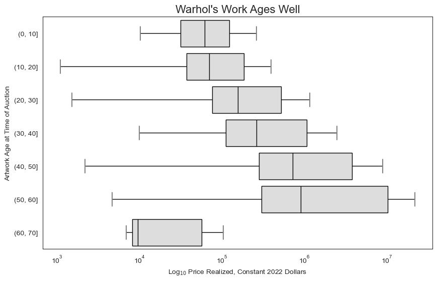
9. Warhol’s Work Accrues Value with Age
Here’s another intuitive one: As Warhol’s work gets older, it accrues value.
Takeaways
- Target variable should be not
price_realized_USDbut its log. - For dimensional variables (
width_cm,height_cm, andarea_cm_sq), the model should be trained on their log (although there doesn’t appear to be much correlation here). - With all the other features we examined, there do seem to be very real and noticible correlations with price, which makes me think we’re on the right track for a functional model specific to Warhol.